CSS Container Queries (@container): Component-Aware CSS in 2026
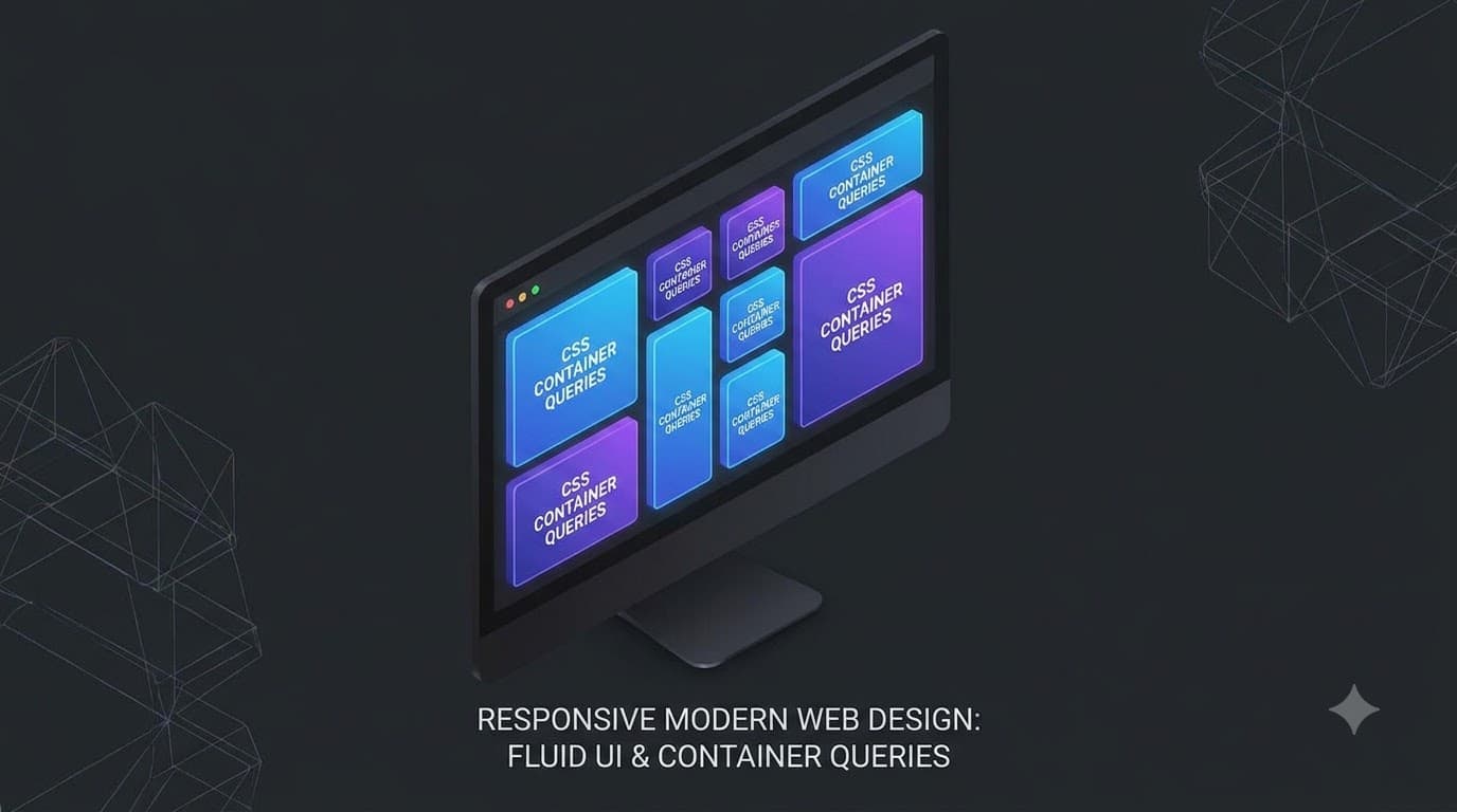

Table of Contents
For nearly a decade, responsive web design relied exclusively on Media Queries (@media). While revolutionary at the time, media queries have a fundamental flaw in the era of component-driven architectures (React, Vue, Web Components): they only know about the viewport.
When you build a reusable <Card> component, you want it to look good whether it's placed in a wide main content area or squished into a narrow sidebar. Using media queries, the card can only react to the size of the browser window, not the size of its actual parent container. This forces developers into writing complex CSS architectures (like BEM modifiers: .card--sidebar) to manually adjust styles based on placement.
Enter CSS Container Queries (@container). In 2026, with universal browser support across all modern rendering engines, Container Queries allow components to query the size of their parent container directly and adjust themselves accordingly.
Modern CSS & Responsive UI Architecture
Interactive Live Demo: The Self-Adapting Card
Try dragging the Container Width slider below. Notice how the card automatically transforms from a stacked vertical layout into a horizontal media layout as soon as its parent container crosses 420px — completely independent of your actual screen or browser width!
How Container Queries Work
The implementation involves two straightforward steps:
- Define an element as a container via
container-type. - Allow children to query that container via
@container.
1. Defining the Container Context
To establish a containment boundary, apply the container-type property to the wrapper element:
.card-grid {
  /* This element is now a queryable container */
  container-type: inline-size;
  container-name: card-wrapper; /* Optional name identifier */
}
inline-size: Queries the width along the writing mode axis (most common).size: Queries both width and height dimensions.normal: Default state (not a container).
You can also use the shorthand: container: card-wrapper / inline-size;
Container Query Units (cqi, cqw, cqh)
Just as viewport units gave us vw and vh, Container Queries introduce relative units tied directly to the container's computed box size:
cqi: 1% of the query container's inline size (usually width).cqb: 1% of the query container's block size (usually height).cqmin/cqmax: The smaller or larger value ofcqivscqb.
These units unlock fluid typography and spacing that scales smoothly inside any sidebar or widget.
Live Fluid Typography Demo:
Real-World Example: A Universal Newsletter Component
Imagine a newsletter signup widget that you want to drop into three distinct locations:
- Inside a narrow blog sidebar (width ~280px)
- Inline inside a blog post body (width ~500px)
- Spanning the entire site footer (width ~900px)
With media queries, you would need separate classes like .newsletter--sidebar and .newsletter--footer. With container queries, the component handles its own layout transitions internally:
You Might Also Like
- Tailwind CSS v4: What's New and How to Upgrade
- Modern CSS Animations: High-Performance GPU Transitions
- CSS Grid vs Flexbox: The Interactive Visual Decision Guide (2026)
- Automated Visual Regression Testing Services in 2026
Frequently Asked Questions
Yes. CSS Container Queries (@container, container-type, and cqi units) have universal baseline support across Chrome, Edge, Safari, Firefox, and mobile browsers since early 2023.
No. The optimal architecture uses @media for macro page layouts (root grid, page margins, global navigation bars) and @container for micro component layouts (cards, lists, modals, widgets).
Conclusion
Container Queries represent the biggest paradigm shift in CSS since Flexbox and CSS Grid. By shifting responsive logic away from the global viewport and into local component boundaries, you build truly modular, plug-and-play UI design systems.
Free In-Browser Developer Tools
Clean AI CLI logs, build cron expressions, decode JWTs, and calculate chmod permissions offline.
Related Articles
CSS Grid vs Flexbox: The Interactive Visual Decision Guide (2026)
Stop guessing. See CSS Grid and Flexbox side-by-side with live interactive demos, decision trees, and real-world layout patterns you can edit in your browser.
Read more
CSS Glassmorphism in 2026: GPU Compositing, backdrop-filter & Tailwind Recipes
Frosted glass UI is everywhere. Learn how backdrop-filter leverages GPU compositing, how to bypass mobile Safari quirks, and how to craft accessible Tailwind glass designs.
Read more
Color Palettes I Actually Use Instead of Tailwind's Defaults
After moving my projects off Tailwind, I needed color palettes that didn't make my sites look like every other Tailwind site. Here are the ones that stuck.
Read more